So while I was going to do a bit more in depth analysis, I'm sorry, I just don't have the time. But I will say this;
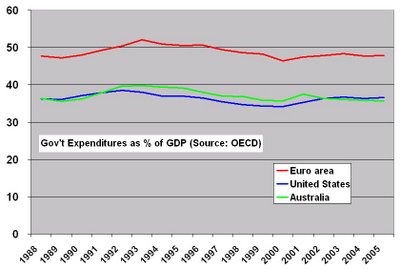
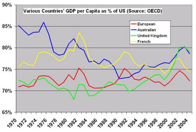
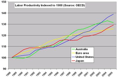
When I pulled these figures from the OECD I was amazed just how similar Australia and the US were. I'm kind of amazed how countries that were once under the British Empire do markedly better than any other empire, HK, US, Australia, etc.
Anyway, here are the charts.


And of course, what professional, full scale, in-depth macro-economic analysis is complete without the manditory analysis of a country's Miss Universe contestant? Besides, the Gods of Bachelortude demand it!

Your analysis has one fault: You rather should've posted a picture of Miss Australia 2006, Erin McNaught(y)! I think she better reflects the high productivity of the Australian people, i.e. making the most out of less (clothes) ;-)
ReplyDeleteAnyway, I noticed a big dive in the GDP curve of Australia relative to the US. What happened? Had it something to do with their import-substituting-policy that they'd implemented after 1945, and probably ended in the 1970s, thereby confronting unproductive parts of the economy to the full-blown worldwide competition?
One graph missing; federal debt comparison
ReplyDeleteI had it, lost it, they're in better shape than America.
ReplyDelete